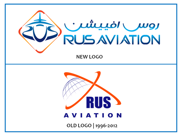
RUS Aviation launched a new corporate identity and logo proving the innovativeness and creativity of aviation giant.

New style new horizons!The new corporate identity is created using such stylish and contrasting colors as: dark blue, light blue and orange which compiled in absolutely new style. In the diamond-shaped logo with airplane inside designers proficiently scripted the word “RUS” in the lines of airplane, so it creates the idea that airplanes are the entity of RUS Aviation. This eye-catching and innovative idea is in line with the company’s stated vision to make its mark in air cargo solutions, simultaneously leaving no stone unturned to further improve services and strive for excellence by constantly maintaining on-time performance, providing quality services and upgrading its teams skill sets.The updates were reflected on company’s web-site showing to the public all the adjustments and improvements. Now after visiting the web-site you can easily make sure how the convenience, navigation level, information value and appearance raised up to support the pillars of RUS Aviations trustworthiness : punctuality, flexibility and transparency. Adopting an innovative approach and throwing up custom-made solutions, are the brand values on which the company revolves.
Source: RUS Aviation HQ
